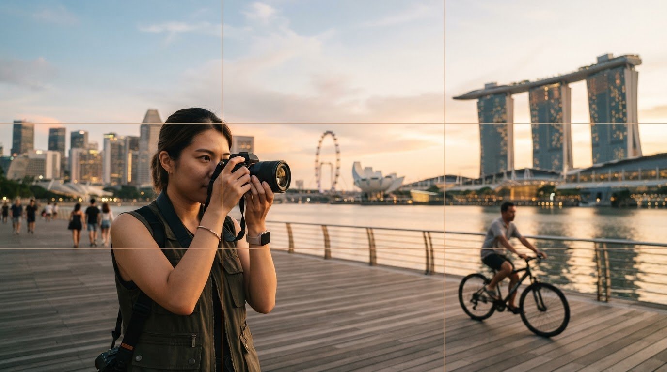

Rule of Thirds Photography Examples and How to Use Them
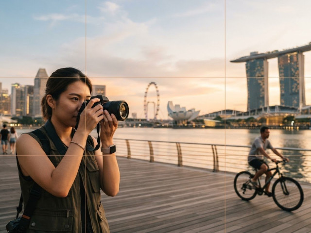
The rule of thirds divides a photograph into nine equal parts with a 3×3 grid. Place your main subject along a grid line or near one of the four points where the lines cross to create a balanced, lively composition. The most useful rule of thirds photography examples show how this works in landscapes, street scenes, and portraits.
If composition feels like a guessing game, you’re not alone. The grid gives you a straightforward starting point without turning every photograph into a rigid formula.
In this article, you’ll see where to place a landscape horizon, how to position a person’s eyes in a portrait, and why leaving space ahead of a moving subject can make a frame feel more natural. You’ll also learn when a centred or deliberately unbalanced composition may work better than the thirds grid.
Treat the rule as a practical guide, not a test. Compare different placements, notice how each changes the mood, and choose the composition that best directs attention to what you want viewers to see.
Key Takeaways
- Use the 3×3 grid to place a subject along a line or near an intersection, creating space and visual balance.
- For portraits, try aligning the eyes with the top horizontal line, then adjust the framing to suit the expression and pose.
- In landscapes and street scenes, use horizon placement and open space to shape where the viewer looks and how movement feels.
- Choose a centred or deliberately off-centre composition when it better supports symmetry, intensity, or a sense of isolation.
- Compare a few different framings of the same subject to see how placement changes the photograph’s mood.
The 3×3 composition grid
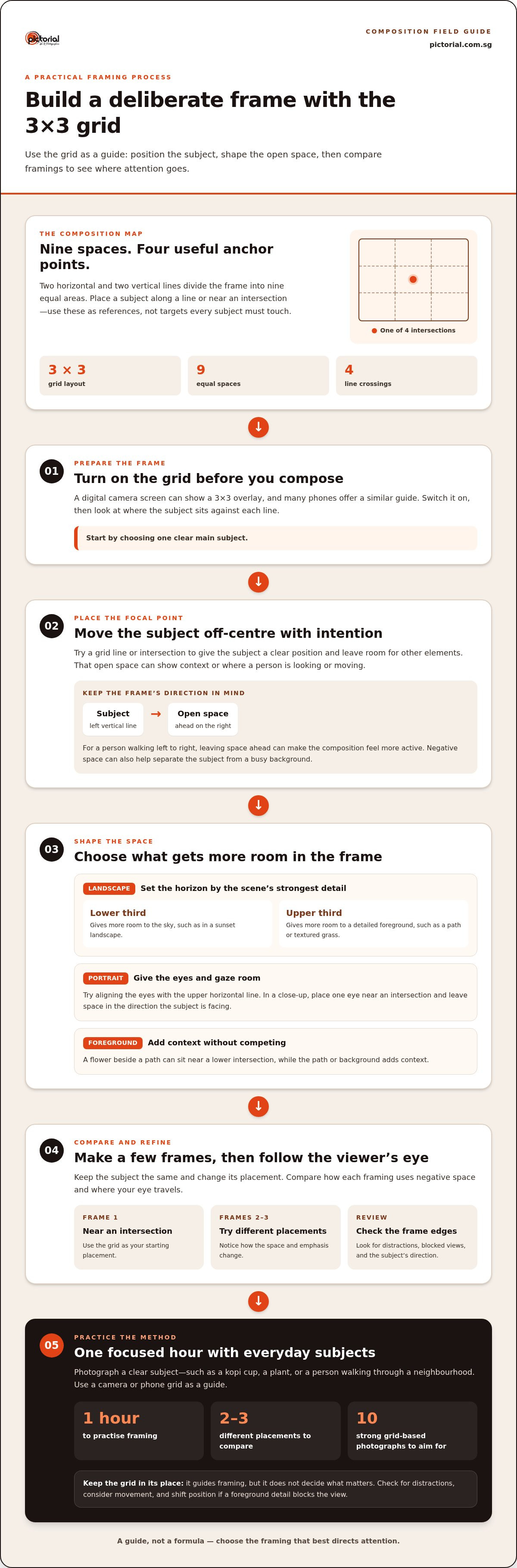
A 3×3 grid divides the frame into nine equal spaces with three rows and three columns. Use its lines and intersections to position the main subject, horizon, or open space deliberately.
Two horizontal and two vertical lines create four intersections, useful anchor points for a subject that might feel static in the centre. A digital camera screen can display a 3×3 grid overlay, and many phones offer a similar composition guide. Turn on the grid before framing, then compare where the subject sits against each line.
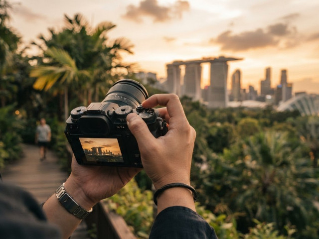
In a sunset landscape, placing the horizon on the lower third gives the sky more room. If the foreground has stronger detail, such as a path or textured grass, place the horizon near the upper third to give that area more space. The grid helps you decide which part of the scene should draw attention.
Guiding the Viewer with Off-Center Placement
Off-centre placement puts the subject along a grid line or near an intersection, rather than in the middle of the frame. This creates a clear point of entry for the viewer, while the remaining space can show where the subject is looking or moving.
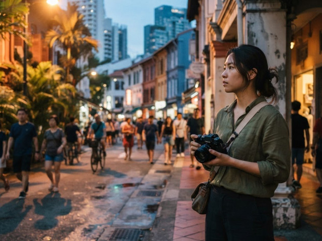
For example, place a person walking from left to right on the left vertical line, then leave space ahead on the right. The open area suggests their direction and makes the composition feel more active. Negative space also helps separate the main subject from a busy background, such as pedestrians behind a person on a Singapore street.
Composing Portraits and Foreground Subjects
In a portrait, placing the eyes along the upper horizontal line gives the face a clear visual anchor. For a close-up, position an eye near an intersection and leave space in the direction the subject is facing.
That open space gives the subject’s gaze room to lead the viewer. If their body angles to one side, place them on the opposite third so their pose points into the frame. For a foreground subject, such as a flower beside a path, keep the flower near a lower intersection and use the path or background to add context without competing for attention.
Practicing Composition with Gridlines
Beginners in Singapore can practise by photographing everyday subjects for an hour, using a camera or phone grid as a guide. Choose a clear main subject, such as a kopi cup on a table, a plant, or a person walking through a neighbourhood.
Make one frame with the subject near an intersection, then take two or three more with different placements. Compare how each uses negative space and where the viewer’s eye travels. A useful exercise is to aim for ten strong photographs that follow the grid, rather than rushing through many scenes.
Gridlines guide your framing, but they don’t decide what matters in the photograph. Check the edges for distractions, consider the subject’s direction of movement, and shift position if a foreground detail blocks the view. These small choices make the grid a practical tool, not a substitute for looking closely.
What Is the Rule of Thirds?
The rule of thirds divides a photograph into nine equal parts with two horizontal and two vertical lines. Their crossings create four intersections, giving you clear reference points for important elements.
Placing Subjects on Lines and Intersections
Placing a subject along a grid line or near an intersection gives it a deliberate position in the frame. This can create a balanced composition while leaving room for other elements.
Imagine a person standing beside a corridor window: placing them near a vertical line keeps the repeating windows visible. A tree can sit near an intersection while the surrounding sky and field provide context. The intersections are useful reference points, not targets every subject must touch.
Linear elements can follow the grid too. Align a table edge with a horizontal line, or place a lamp post near a vertical guide. In a walkway photograph, a railing can lead towards the subject and add structure to the frame. If the line leads away from the subject, shift your camera position or adjust the crop.
Positioning the Focal Point
The grid helps you give the focal point a clear position, guiding the viewer’s attention. This is useful when several elements compete for notice, such as a person, a sign, and a busy background.
Choose your main subject before framing. In a photograph of a cyclist beside a row of shophouses, place the cyclist near an intersection and let the buildings establish the setting. For a close-up of a cup, position it near a lower intersection while the table and café details fill the remaining space. The strongest focal point depends on the story you want the frame to tell.
The golden ratio is approximately 1.618 and offers another way to think about visual balance. It isn’t the same layout as the nine-part grid, and you don’t need to calculate it to compose a photograph. Start with the thirds grid, then compare the result with a tighter or more central crop. The better position is the one that gives the subject clear emphasis without making supporting details feel accidental.
To add a grid in Canva, place two vertical and two horizontal guide lines over the image to divide it into nine equal areas. Use them as temporary guides, then remove them before exporting. This helps you check whether a crop keeps a face, product, or horizon near a useful line or intersection.
Portrait eye placement
In portraits, align the eyes with the upper horizontal line to give the face a strong position. For a close-up, placing one eye near an intersection can add emphasis while leaving room for the subject’s gaze.
Choose your focus point before shooting. Animal photographer Carli Davidson says she focuses on the eyes, a practical approach for portraits of people and pets. When both eyes are visible, keep them close to the same horizontal level unless the pose deliberately tilts the face. In a vertical portrait, leave space above the head without placing the eyes too low.
Use the subject’s gaze to guide the open space. If someone looks towards the right edge, place them left of centre and let the background extend ahead. This gives the viewer room to follow their gaze. If the person faces the camera, a tighter crop with the eyes near the upper intersections can create a more immediate connection.
Small subjects need a different balance. A child standing beneath a tall tree, or a bird on a branch, may occupy only a small part of the frame. Place the subject near an intersection, then use surrounding space to show scale and setting. In a Singapore park, open greenery can frame a bird without pulling attention away from its eyes.
Frame-filling portraits work differently because the face already dominates. In a close crop, the eyes can sit near the upper third while the mouth and chin fill the lower area. Check that the crop doesn’t cut through a joint or leave an awkward sliver above the head. A slight camera shift can restore balance.
Other scenes show how eye placement connects to the wider composition. In a nature photograph, place a bird’s eye near an upper intersection and let its body extend along a vertical third. In street photography, frame a person’s face to one side while keeping their direction of movement visible. These placements help the subject stand out without losing the setting.
Portrait photography examples are more useful when you compare different framings of the same pose. Take one frame with the eyes on the upper-third line, then another with the face centred. Notice how the background, gaze, and distance change the mood. Warm late light can add a golden tone, but clear focus on the eyes and purposeful framing keep the portrait readable.
When to break the rule of thirds
The thirds grid is a starting point, not a command. Break the rule when a centred, edge-led, or deliberately spacious frame better captures the subject’s shape, mood, or relationship with its surroundings.
A common mistake is placing a subject near a grid line without considering its gaze, movement, or background. Don’t force every important element onto an intersection. Check whether the framing serves the photograph’s purpose.
A centred composition can strengthen a symmetrical subject. For example, put a building in the middle when its two sides mirror each other. A lake reflection can also suit a central horizon, especially when the water and sky repeat similar shapes. The balance comes from the scene’s symmetry, not the grid.
A direct-to-camera close-up is another reason to centre the subject. A face filling the frame can feel powerful and confrontational when both eyes meet the viewer. Keep the horizontal framing steady and remove distractions around the face, so the central position feels intentional rather than accidental.
Breaking the rule can also create a sense of isolation or minimalism. Place a small subject near the frame’s edge and leave broad empty space around it. A lone figure against an open wall, for example, can appear distant from their surroundings. The empty area becomes part of the image’s meaning, rather than unused space.
In a landscape, decide which element deserves the most emphasis before placing the horizon. A sunset may call for more sky, while a foreground pattern may need more room below. But a level horizon near the centre can suit a scene where sky and land have equal visual weight. The best position reflects the scene’s balance.
- Don’t place a subject off-centre by habit. Check that the open area adds direction, context, or breathing room.
- Don’t centre a subject without a reason. Look for symmetry, direct eye contact, or a deliberate sense of stillness.
- Don’t cut off meaningful space. A person looking toward the frame edge may feel crowded if no room remains ahead.
- Don’t let the horizon tilt unintentionally. A dramatic slant should support the scene’s effect, not distract from it.
Try a simple comparison with one subject: take a thirds-based frame, a centred frame, and an edge placement. Review all three for balance, empty space, and the viewer’s first point of attention. This shows whether breaking the rule strengthens the idea or weakens the composition.
Photographic examples of the rule of thirds
Photographic examples make the thirds grid easier to understand by showing how placement changes a scene. These rule of thirds photography examples focus on the subject, open space, and background, rather than treating the grid as a fixed recipe.
In a landscape, place a tree or mountain peak along a vertical third. Leave open sky or land around it to give the feature visual space while keeping its setting visible. If the mountain is the main point of interest, position it near an intersection. If the sky has striking cloud detail, give it more room instead. Let the frame’s emphasis follow what you want viewers to notice first.
For a street photograph, position someone walking from left to right near the left vertical line. Leave the right side open so the viewer can follow their movement into the frame. Compare this with a version that places the person on the right. Changing the space ahead can make the same walk feel more settled or constrained.
A nature photograph can apply the same principle to a small subject. Place a bird near an upper intersection, then let a branch lead through the frame. The branch adds direction while the remaining sections show the habitat. For a close-up of a flower, try placing the bloom off-centre and keeping a leaf or stem visible, so surrounding details support rather than crowd it.
Vertical images need careful framing, too. A 9×16 crop for TikTok or Instagram Reels can keep the face or main action in the top two-thirds, since screen controls may cover the bottom third. For example, frame a dancer with their face above the middle and enough room below to show movement. Check the crop before shooting, because a subject near the edge may disappear from the final frame.
Compare two frames to understand the effect. Photograph the same scene with the subject near a third, then place it in the centre. Keep the camera position and background steady. Notice whether the off-centre version guides the viewer through the image, or whether the central version makes symmetry clearer. This comparison turns the principle into a conscious choice.
For practice, choose a familiar scene such as a bus stop, park path, or market stall. Take one frame using the thirds grid, then make two or three more with different subject placements. Review them side by side. Which makes the subject easiest to notice? Which has useful negative space? Does anything in the background compete for attention? These rule of thirds photography examples help you judge the effect of each placement.
- Landscape: Set the peak or horizon according to the strongest detail.
- Street scene: Leave space in front of a moving person.
- Vertical crop: Keep important action clear of interface controls.
Practise composition in a photography workshop
Pictorial: Photography Starter Session
Pictorial’s Photography Starter Session offers practical guidance if you understand the grid but find it difficult to compose confidently while shooting. In a small-group outdoor session, practise framing real subjects, compare different placements, and see how composition changes a photograph.
Groups are limited to three participants, allowing for personalised guidance as you practise. Bring your own camera or use a complimentary loan camera, and learn core camera controls alongside composition. This is useful when gridlines make sense on screen but are harder to apply to a moving person, a portrait, or a busy street scene.
For continued learning, Pictorial also offers the Intermediate Photography Course, Mobile Photography Essentials, and Complete Photography Course. Contact Pictorial to discuss the Photography Starter Session.
Take Your Next Frame with Intention
Make composition a choice you can explain, not a formula you follow automatically. Keep exploring rule of thirds photography examples, then photograph a familiar scene with a clear purpose. Ask what deserves attention, what belongs in the frame, and whether your chosen placement supports the feeling you want to create.
If you’d like guided practice, Pictorial offers the Photography Starter Session, Intermediate Photography Course, and Mobile Photography Essentials. Each provides a way to keep building your photography skills through practical learning.
Let curiosity guide your next shoot. A thoughtful adjustment to your framing can help you see a scene with fresh eyes, and each comparison teaches you something useful.
Frequently Asked Questions
Landscapes photography: where to put the horizon?
Place the horizon on the lower third when the sky is the main attraction, such as a sunset with vivid clouds. Move it towards the upper third when foreground details, such as reflections or shoreline patterns, are more interesting. Keep the horizon level unless a deliberate tilt supports the scene. Before taking the photograph, decide whether the sky, land, or their relationship tells the story best.
Where to place the eyes?
For a portrait, place the eyes near the upper horizontal grid line; in a close-up, try an intersection. If the subject turns their head, leave enough space in front of their gaze so the face doesn’t feel pressed against the edge. Focus on the nearer eye when the face is angled, then check the frame’s edges for background distractions.
What is the rule of thirds in photography?
The rule of thirds divides a photograph into nine equal areas using two horizontal and two vertical lines. Their four intersections offer reference points for positioning a subject or another important detail. For example, a cup on a table might sit near a lower intersection while the table setting remains visible. The guide helps organise the frame but doesn’t dictate one correct composition.
How does the rule of thirds grid work?
The grid creates three columns and three rows, with lines you can compare against important elements in the scene. Use a horizontal line to position a horizon or tabletop, and a vertical line to place a person or tree. Intersections can draw attention to a face or object. Turn on your camera’s grid display while framing, then check that the placement suits the subject’s direction and surroundings.
What are examples of rule of thirds in landscape photography?
Place a mountain peak near a vertical third, leaving open sky or land around it to show scale. A shoreline can follow a horizontal guide, with more space given to whichever side has stronger detail. For a winding path, position its entrance near a lower intersection and let the path lead inward. These choices connect the landscape’s main feature with its setting.
What are examples of rule of thirds in portrait photography?
In a vertical portrait, place the face near an upper intersection and leave room in the direction the subject is looking. For a seated portrait, position the subject off-centre while keeping a meaningful detail, such as a book or window, visible on the other side. In a tighter headshot, keep the eyes prominent and avoid cropping through the chin. Each placement gives the viewer a different sense of closeness.
How do you use the rule of thirds for street photography?
When someone walks across the frame, place them opposite their direction of travel, leaving open space ahead. On a busy street, wait until they separate visually from signs, poles, or other pedestrians. A doorway or pavement edge can help organise the background. If the subject pauses or faces the camera, try a different placement that gives their expression more emphasis.
Where should you place the subject using the rule of thirds?
Place the subject along a grid line or near one of the four intersections, choosing the position that suits its role in the scene. A face may need a clear intersection, while a long object can follow a vertical line. Keep open space where it adds context or direction. If the subject looks or moves towards one edge, leave room there; if symmetry matters, a central position may work better.

Disclaimer
© Pictorial | All Rights Reserved.